Due to the constant development of the software and enhancing its capabilities, the web server interface may differ from the interface described in the current document.
To log into the system, you should have credentials provided by the administrator.
The role assigned to the user defines how this user can interact with the system.
You can check your role on the panel in the upper right part of the screen.
A corresponding role icon will be displayed next to the username.
There are four types of roles in the ViCont system: Guest, Operator, Administrator, Owner. Below is a comparison table describing each role.
Icon
Role type
Access type
Role description
Guest
Limited
The user can view all pages and windows with settings, but cannot make any changes.
Operator
Partially limited
The user can fully manage the system and players, but the role does not imply managing the users.
Administrator
Unlimited
The user has a full-featured access to the system, including adding new users, assigning user roles, or deleting existing users.
Owner
Unlimited
There can be only one user with this role in the system. It is created with the admin name by default when a ViCont server is installed for the first time. Such a user cannot be deleted and has the same rights as an administrator.
To view the list of users added to the system and their roles, click the gear icon in the upper right corner of the screen and select the Accounts item.
You will see a page with all the users and their roles listed in a table.
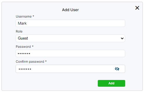
If you have administrator rights, you can add a new user by clicking the Add button above the table.
In the opened window, specify the name of the user and their role in the system. Set a password and confirm it.
Click Add.
The administrator can also edit the data of the users, except the Owner.
Go to the Control column in the table and click the button in the required user row.
Specify a new name and(or) user role in the opened window.
To change the password, click the Change password toggle, specify and confirm a new password value.
Click the Apply button.
Note
On the Accounts page, you can edit the settings of other users only.
To edit the settings of your own profile, e.g. the password, click the name of the role in the upper right corner and select Edit Profile.
Set and confirm a new password.
Click Apply.
To remove users, tick their checkboxes and click the Delete button that will appear above the table.
The administrator can access data about the actions of the users in the system.
To view this data, click the gear icon in the upper right corner and select the History of Actions item.
On the page that opens, set a period for which you want to view the history.
Then select a filter from the drop-down list and specify a value for this filter in the field next to it. The following filters are available:
User — filtering by the user name.
Method — filtering by the functional part of the system, within which the action was performed.
Action — filtering by a certain action.
Status — filtering by the action status: Fail or Success.
You can set multiple filters simultaneously by clicking .
To delete one of the filters, click to the right of the field for selecting the filter value.
After you are done with settings, click Apply.
To remove all filters, click Clear All.
You can download the created report by clicking the Export to CSV button that will appear above the panel of filters after you generate the report.
The Statistics page displays statistical information about the playback of files or streams by players or groups of players.
To open the page, click the gear icon in the upper right corner and select the Statistics item.
To display the information, set a period and apply filters.
You can filter by the names of players, groups, streams, videos or pictures.
To set multiple filters simultaneously, click .
To delete one of the filters, click to the right of the field for selecting the filter value.
After you are done with settings, click Apply.
To remove filters, click Clear All.
Note
If you don’t set up filters, but click Apply straight away, the page will display information about all streams/files and for all players/groups for the entire period.
The information is output as a table below the panel of filters.
There are two display modes: Summary and Details.
You can switch between the modes by clicking the corresponding tabs above the panel of filters.
In case of filtering by files, the Summary section will display the number of successful playbacks and failures for the selected players or groups during the specified period.
A playback failure is a situation when the file was not played to the end or was not played at all.
For streams, the playback time and URI will be specified for each stream.
In the Details section, you can view the end and start time of playing a certain file or stream, as well as its success status.
The generated report can be saved to your computer by clicking the Export to CSV button that appears next to the page name above after you generate the report.
To manage player packages, click the gear icon in the upper right corner of the page and select Player Packages.
You will see a list of uploaded packages on the page that opens.
To upload a new player package to the system, click the Import button above the list and select a player archive in the tar.gz format.
Confirm adding the package and click the Upload button.
The uploaded package will be displayed in the system and will become available for player installation.
Note
When adding a player package, the system will need some time to upload it into the web interface.
To download a player package, go to the Control column and click the button in the row of the required player.
The button appears when you hover over the row.
To delete an uploaded package, tick its checkbox and click the Delete button that will appear above the package list.
To manage server settings, click the gear icon in the upper right corner of the interface and select Server Settings.
A window with several tabs will appear.
The Main tab is used to set the following:
Network interface — the address the player will use to access the web server.
Port — the port number the player will use to access the web server.
Both values are required to install the player via the web interface.
The Rotation tab is used to set periods for storing player statistics, history of actions, and thumbnails.
In the License tab, you can upload a new license or view the status of the current one.
A license is required to use all the player features. Without it, the player will remain locked, i.e. all parameter changes will not be applied.
To obtain a license, you need to create a certificate request by clicking the Download CSR file button. The downloaded file must be sent to the Elecard Technical Support Team.
Get a certificate from the support team and upload it to the server using the Upload license file button.
After adding the license, the information window will display the following details:
Maximum number of players — the number of players that can be added to the system.
Limit of running players — the maximum allowable number of players working simultaneously.
Demo version/Full version — type of applied license.
Expiration date — the last day of the applied license validity.
The Versions tab contains information about the versions of the product, server, and UI.
ViCont pages are grouped in four sections: Devices, Content, Sources, Emergency.
You can move between sections and separate pages using the navigation panel to the left.
The content of the current page is displayed to the right of the panel.
Below you can find a detailed description of the sections and pages.
ViCont devices are players that can either be standalone or joined in groups.
In the latter case, group settings are applied to them.
Devices play the media content transmitted from a web server.
There are two sources of content: schedules and channel lists.
You can create a schedule from files (video/audio, images), playlists, streams, presentations, web pages.
A channel is created based on a schedule or a stream.
Next, the schedule or the channel list is assigned to a certain player.
To manage devices, go to the Devices section on the left panel and open the required page, i.e. Players or Groups.
On the Players page, the user can view information about standalone players as well as manage them.
The page contains two tabs: Players and Unregistered Players.
The second tab is for adding players that were installed not via the web server interface.
The procedures of installing and adding a player are described in the Quick Start Guide.
The information about players is displayed as a table and includes name, description, group (if the player is included in the group), source, player package version, status, and the time the playback started.
You can filter the information in the table by the name, group, schedule, channel list, description, MAC address, and(or) external IP of the player.
Click the Filters button above the table and select the required filter from the drop-down list.
In the field next to the list, specify a value for the filter.
You can add more filters by using or remove them by clicking .
After you are done with the settings, click Apply.
To clear the filters, click Clear All.
You can manage players using buttons in the Control column.
Clicking the icon will open a window where you can adjust sound volume level or select a channel if a channel list is used as a source of content for the player.
To adjust volume, use and buttons or enter the exact value right in the Volume field.
When editing the value, the field will be highlighted in yellow.
As soon as you leave the field—which you can do by clicking on anywhere within the window, for example—the color will change back to white, and the new volume value will be applied.
You can also mute or unmute sound with the button.
To switch to another channel, select it from the Channel drop-down list.
The selected channel and the current volume level are displayed in the upper part of the window.
The button opens a window for editing player parameters (see the Editing Player section).
The button in the Control column lets you lock the player to avoid changing its settings accidentally.
When the player is locked, any change in its settings, including changing the group, will be applied only when the player is unlocked.
If you change the settings of the group in which the locked player is included, the player will continue to use the settings that were active before locking.
The updated group settings will take effect for such a player only after it is unlocked.
The button in the Control column restarts the player.
You can also view the history of content playback in the form of thumbnails.
Go to the History column and click .
In the opened window, you will see a timeline with thumbnails that is updated in real time (moves left).
The current moment is marked with a vertical red line.
Above the timeline, there is information about the player and control buttons, the same as in the table with the list of players.
To view the thumbnail history for a certain period, set the from and to dates in the fields under the timeline and click Apply.
You can sort the records using the button.
To clear the filters, click Clear All.
To go back to the list of players, use the Players button.
If you select one or multiple players, the edit, lock/unlock, and restart buttons will appear on the panel above the list of players.
Some additional buttons will appear as well.
The Command button opens a window where you can enter commands to manage the state of the player or the divice it runs on.
Enter the command name in the Parameter field and pass the command value to the Value field; click Apply.
The list of commands and values can be obtained from the Elecard Technical Support Team.
The Redirect button allows you to connect the player to another server.
Click the button, enter the address of the new server, click Apply.
Using the Delete button, you can remove selected players after you confirm the action.
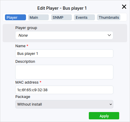
To edit the device settings, go to the Control column and click the button in the row of the selected player.
This will open the Edit Player window with several tabs.
The Player tab displays basic information about the player (name, description, MAC address).
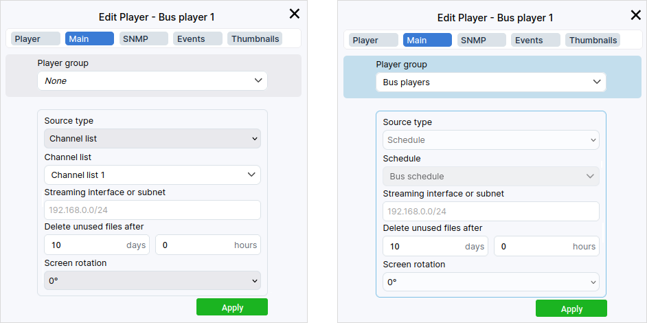
You can assign the player to a certain group by selecting the required item from the drop-down list in the Player group field.
This field is available in each tab of the player editing window.
If you add the player to a group on one tab, changes will be automatically applied on other tabs.
The field itself will be colored in blue.
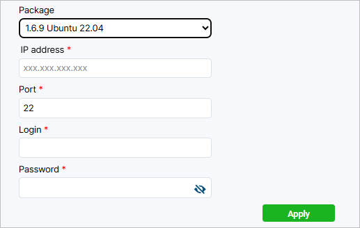
If you need to install a player package, expand the list in the Package parameter and select a version for installation.
Enter the player IP address and port (the default port is 22).
Set a login and password.
In the Main tab, you can assign a source of content to the player by selecting the required item from the Source type drop-down list.
Then select either a schedule or a channel list in the field below (depends on the selected source type).
In the Streaming interface or subnet, you can explicitly specify an IP address or a subnet mask of the network interface for the input stream.
In the Delete unused files after, you can specify a period after which files will be deleted from the storage of the player device.
The period starts from the moment when a certain file is removed from an active schedule.
Also, the period starts after the playback of the file is over, provided this file is not used in the schedule in the future.
The Screen rotation setting allows changing the orientation of the player screen.
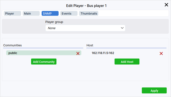
In the SNMP tab, you can configure SNMP notifications to monitor player events.
The player sends SNMP notifications each time when a media file starts and ends playing, or when a stream broadcasting starts or interrupts due to a stream loss.
To create a new community, click the Add Community button.
Then specify recipients by clicking the Add Host button and provide an IP address and port.
This way, you can add the required number of recipients and communities.
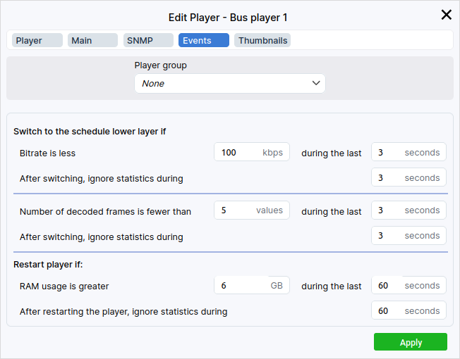
The Events tab allows configuring the player behavior if a problem occurs with an input stream.
If a schedule with multiple Media layers is assigned to the player, you can configure the player to switch to a lower layer in the following cases:
the bitrate of the upper layer stream is below the threshold value during the specified period;
the number of decoded frames in the upper layer stream is below the threshold value during the specified period.
If the schedule contains only one Media layer, you will see a black screen in case of problems with the input stream.
When a channel list is assigned to the player, and a channel is on whose source is a schedule with multiple Media layers, the player will also switch to a lower layer in case of problems.
In other cases, you will see a black screen if an issue occurs.
To avoid excessive memory usage, the mechanism of player restart is used.
If memory usage reaches the threshold value during the specified period, the player will restart.
After switching to a lower layer or the player restart, the system initialization takes time. For each of the mentioned events, you should specify a time that should pass before statistics will be again collected.
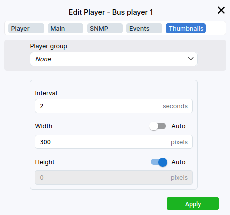
Finally, you can set an interval for creating thumbnails and their resolution in the Thumbnails tab.
As soon as you are done editing the parameters, save changes by clicking the Apply button.
Note
If a player is assigned to a group, the assigned group’s parameters will be applied to said player. The frame around the parameters will be colored in blue.
Group parameters can’t be changed in the player window. Instead, you can change them in the associated group’s settings.
You can join players in groups if you need to scale streaming.
Groups let you manage multiple players simultaneously, while controlling each group separately.
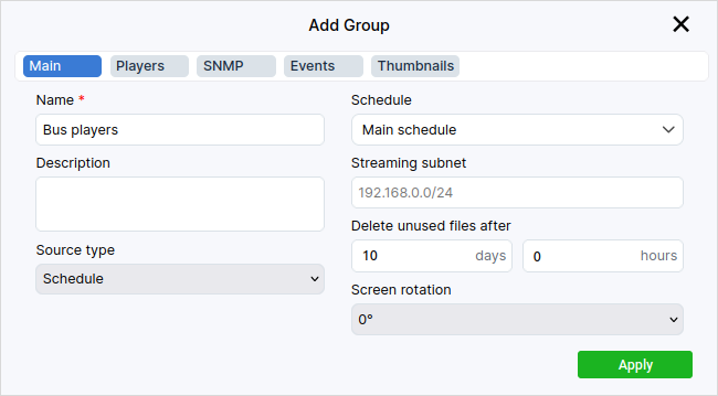
To create a group, go to the Groups page in the Devices section and click Add.
You will see a page with several tabs.
The Main tab contains the name of the group and its description.
As with configuring a player, you set the type of source for the group, select a subnet, and (or) specify the screen rotation as well as a period for storing files.
You can additionally assign a certain schedule or channel list as the source of content.
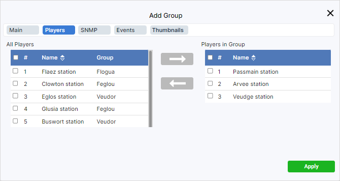
In the Players tab, you can add players to the group or remove them using buttons with arrows.
The procedures for setting up SNMP notifications, events and thumbnails are identical to those in the description of the player setup.
After you are done with settings, click the Apply button.
To change the parameters of an already created group, use the edit button in the Control column.
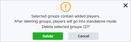
You can delete one or more groups by selecting them and clicking the Delete button. Confirm the deletion in the window that opens. If players are added to the selected groups, they will switch to individual settings after group deletion.
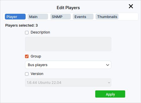
The mass editing tool allows you to change the parameters of multiple players at the same time.
To start editing, go to the Players page, tick the checkboxes of the necessary players in the list, and click the edit button .
The tabs in the mass editing window are similar to those used when setting up individual players.
Go to the necessary tab, select the required parameters by ticking their checkboxes, and make changes.
After editing, click Apply.
The Content section comprises such pages as Files, Streams, Playlists, Presentations, Web Pages, Layouts.
These are the types of content supported by ViCont players.
By selecting a certain page, you can add new content to the system or edit the parameters of already added items.
The Files page is for adding and editing video or audio files, or pictures.
You can use files to make playlists or include them in schedules.
Pictures are also used to create presentations and layouts.
Supported file extensions include:
video: ts,mp4,mpegts,mpeg,avi,mov;
audio: mp3,mp4,m4a,aiff,aac,flac,ogg,wav;
pictures: jpeg,gif,png,bmp.
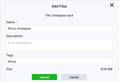
To add a new file, on the panel above the list of files, select either the Videos, Audios or Pictures tab depending on what type of file you want to add.
Click the Import button and select the required file.
Then click the Open button, and the file upload window will appear.
Add the file description and(or) tags; if necessary, rename the file.
Click the Upload button.
You can add multiple files at the same time.
However, adding a description to multiple files or changing their names is not supported.
Note
When adding a file, the system will need some time to upload it to the web interface.
Once uploaded, the file will appear on the page.
To edit an uploaded file, click the edit button in the Control column.
You can change the name, description, and(or) tags.
Hint
If needed, filter out your files by using the name and tag fields in the top-right corner.
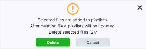
To delete a file, select one or more files and click Delete.
Confirm deletion.
Please note that deleting a file will also remove it from playlists and schedules in which it is included.
If the image file is used as a presentation slide, this slide will be deleted as well.
The Streams page opens up with a table incorporating streams added to the system.
To add a new stream, click the Add button.
In the window that opens, enter the stream name in the Name field.
In the Stream field, specify a network address where the media stream is continuously received from the streaming provider.
Ubuntu-based ViCont players support UDP and RTP streaming, while those based on Android support UDP, RTP, SRT, HLS, and MPEG-DASH protocols.
Optionally, you can protect your streams from unauthorized access via Uplynk DRM.
To do that, toggle the Use Uplynk DRM switch when adding a stream. As a result, the corresponding stream within the table will have a icon added to its row.
Click Add.
After adding a stream, you can change its name, specify a new address, or tweak Uplynk DRM protection, if necessary.
To do this, click the button in the Control column.
To save the stream’s settings, click Apply.
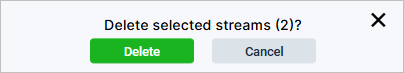
To delete a stream, select one or more streams and click Delete.
Confirm the deletion of streams.
Note that deleting a stream will also remove it from schedules that contain this stream.
If a stream is a source for a channel, this channel will be removed from the list of channels when the stream is deleted.
Playlists are sets of items uploaded to the system: these include audio and video files, pictures, web pages, and nested playlists.
They can be of two types: ordinary and emergency.
An ordinary playlist can be added to a schedule for planned playback.
An emergency playlist is used for organizing emergency broadcasting and cannot be added to a schedule.
You can find more information about emergency playlists in the Emergency section.
To create a new playlist, go to the Playlists page and click the Add button.
In the window that opens, enter the playlist name; if necessary, provide a description.
When you enable the Emergency setting, the playlist will be added to the emergency list.
To set up a playlist, in the table to the left choose what type of element you want to add: supported are the Video, Audio, Picture, Playlist, and Web Page types. Then below tick the checkboxes of the elements you need.
Move the ticked elements to the playlist by clicking the arrow directed to the right.
To delete files, tick them in the playlist (the table to the right) and click Delete.
You can change the order of elements in the playlist.
Hover the cursor over the icon at the start of the required element row, press down the left mouse button, and drag the row up or down.
In the Duration column, you can specify the duration for elements that don’t have it originally, e.g. pictures.
Go to the column and set the necessary value for the required element in the active field.
Note
You can’t change the duration of elements that have it initially, such as video or audio files. In this case, the field in the Duration column will be inactive.
After the playlist is formed, click the Add button.
If necessary, you can edit a previously created playlist.
Click the in the Control column, make the necessary changes, and click the Apply button.
You can delete one or more playlists by selecting them and clicking the Delete button.
Confirm the deletion in the window that opens.
Note that when deleting a playlist, it will be deleted from schedules as well as playlists it is part of.
On the Presentations page, you can upload ready-made PPT, PPTX, PDF, or ODT presentations as well as create new ones from images added to the system.
To upload a presentation, click the Import button and select the required file.
Next, click Open, and the upload window will appear.
If necessary, change the file name and (or) add a description, then click Upload.
After uploading, you can edit the name and description again as well as change the slide order.
To save the presentation, click Add.
To create a presentation, click Create.
In the window that opened, enter the presentation name and (or) add a description if necessary.
Then adjust your slide layout in the list to the left: Tick the pictures you want to add to the presentation.
You can search for pictures by their names using the field which is to the right and above the list.
If there is no required picture, upload it using the Import button.
The picture will appear in the list. It will also be added to the system and appear on the Files page.
Further on, you can include this picture in playlists and schedules.
You can delete any picture by ticking it and pressing the Delete button that will appear above the list instead of the importing button.
Attention
If you delete a picture from the list in the presentation editing window, it will also be deleted from the system, including schedules and playlists if it is added to them.
Add the selected pictures to slides (the list to the right) by clicking the arrow directed to the right.
Note that a picture, if imported, will automatically be added to slides.
The order of slides can be changed using the and buttons in the Position column.
You can enable automatic slideshow with a certain interval.
Click the Automatic slideshow toggle and set a value in the Interval field.
If you don’t specify an interval, the slideshow won’t be functioning even if you enable it.
To delete a picture from the list of slides, tick them and click the Delete button in the middle of the window.
Note
The Delete button becomes active if at least one slide is selected in the list to the right.
You can preview the presentation before saving by clicking the Slideshow button.
To save the presentation, click Add.
If necessary, you can edit the presentation by clicking the in the Control column.
Make changes and click Apply.
To delete a presentation, tick it and click the Delete button.
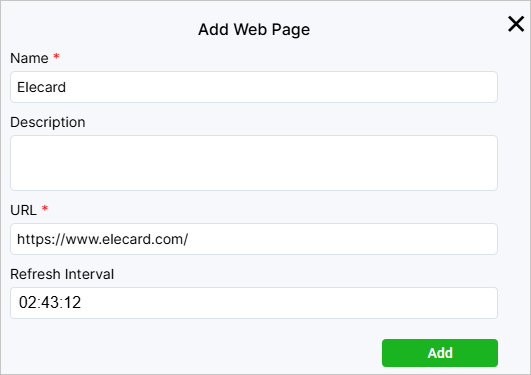
On the Web Pages page you can add a link to a web page to add it to a schedule in the future.
During the playback of the schedule, the web page will be displayed to the user who can interact with it, e.g. using a remote control.
To add a link, click Add, enter the web page Name and URL.
If necessary, provide a description and/or set a refresh interval in the HH:MM:SS format.
Click Add.
You can edit a link by clicking the in the Control column.
Working with layouts is supported by Ubuntu-based players’ version 1.4.2 and higher, as well as Android-based players of all versions.
On the Layouts page, you can add new layouts to overlay streams or video files that should be played.
The layout structure resembles the structure of a web page.
You can create layouts in the native ViCont editor or in an external editor.
The layout created in ViCont is called a native layout and can be changed in the ViCont editor.
An archive with a native layout comprises image files, if used, and the index.html file that defines a set of overlay objects and their order, forming the layout structure.
A layout created in an external editor cannot be changed in ViCont.
An archive with such a layout also includes the renderer.js script, a system file required to play video within the layout.
A list of added layouts is displayed as a table with the following columns:
Thumb — shows the layout thumbnail.
Name — displays the layout name.
Description — contains the layout description.
Type — indicates the layout type. The icon marks layouts created in the ViCont editor that can be edited after creation.
Control — contains the edit button. If you click it, you will see a window in which you can change the layout name and description. In the case of native layouts, you can also edit their structure in the ViCont editor. To open it, click the Editor button. When hovering over a table row, the button for downloading the layout in the form of an archive will also appear in the Control column.
You can create a copy of any layout by ticking its checkbox and clicking the Clone button that will appear above the table.
To delete the selected layout, click Delete.
Below is explained how to create and edit layouts in the ViCont editor.
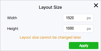
To open the editor and start working on the layout, click the Create button on the panel above.
In the window that opened, set the layout width and height.
The size used by default is 1920×1080 pixels.
Click Apply.
To get back to the screen with the list of layouts, click .
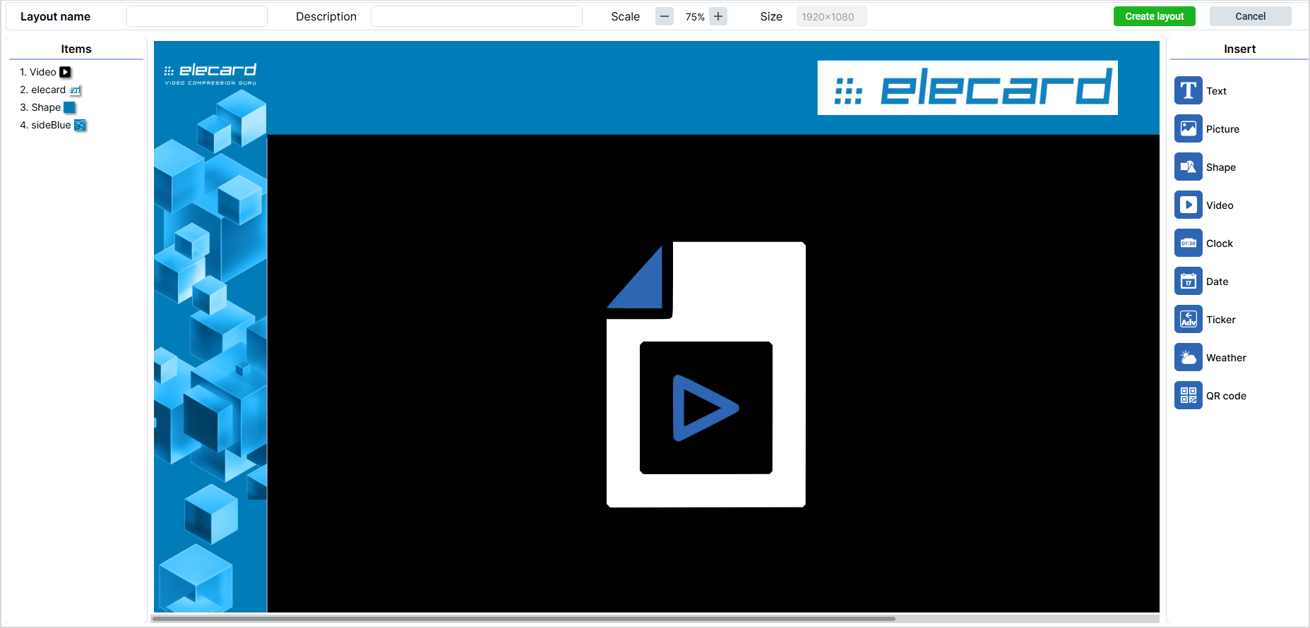
In the center of the editor, there is a work area.
It is in this area that you create a layout by adding and combining items.
Above the area, there is a panel where you need to write the layout name.
Here, you can also provide the layout description, change the scale of the work area, or view the current layout size.
To the left of the work area, there is the Items panel.
It will display a list of all items that you add to the layout.
The display order of items can be set up by changing the order of these items on the panel.
You can also rename an item by double-clicking it and typing a new name.
To the right of the work area, there is the Insert panel where you can select items to insert.
Clicking an item adds it to the work area.
At the same time, the Clone and Delete buttons appear to the left above the work area.
When you click the first button, a copy of the selected item is created in the work area.
Clicking the second button deletes the selected item.
To the right, there also appears the Clear All button. It deletes all blocks and clears the work area.
After clicking it, you need to confirm the action by clicking Delete.
The right part of the screen contains settings of added items.
Some settings are common for all or the majority of items. Others are available only for single items.
You can find a list of available items and their individual settings in the table below:
Icon
Item
Settings
Note
Text
Font: Arial/Courier New/Monospace/Times New Roman
Size: size in pixels
Font style: normal/italic/bold/bold italic
Effects: none/strikethrough/underline
Align: Left/Center/Right/Top/Middle/Bottom
Picture
Shape
Video
These elements employ common features outlined in the next table.
Add both the pictures that were already uploaded to ViCont or import new ones by clicking on Import.
Clock
24-hour time: enabled/disabled
Show seconds: enabled/disabled
Time zone: time zone in UTC
All the Text item settings are available for the Clock item, except effects.
Date
Format: a date in the DD.MM.YYYY, YYYY-MM-DD or MM/DD/YYYY format
All the Text item settings are available for the Date item, except effects. You can also select a UTC time zone.
Ticker
Scroll direction: right-to-left/left-to-right
Ticker speed: a value in seconds that shows the time taken by the ticker to go all the way from appearing to disappearing
All the Text item settings are available for the Ticker item, except align.
Weather
City: a drop-down list in which you can select a city to display weather for
Displayed city name: a box in which you can enter a city name to display on the screen
City search: a box to search for a city by typing its name
Unit of measurement: Degree Celsius (°C)/Degree Fahrenheit (°F)
Show picture: show/hide
Show name: show/hide the city name
All the Text item settings are available for the Weather item, except effects. To find a city, enter its name and click the green circle with a check mark.
QR code
Name: QR code’s name
Information: link or text that will pop up once the QR code is scanned
Size: QR code’s size in pixels
Code color and Background color: palettes enabling you to set the color for your QR code and its background”
After insertion, you can additionally tweak the QR code using the common settings outlined in the next table.
In the table below, you can find settings that are common for the majority of items.
Name
Description
Application
Items
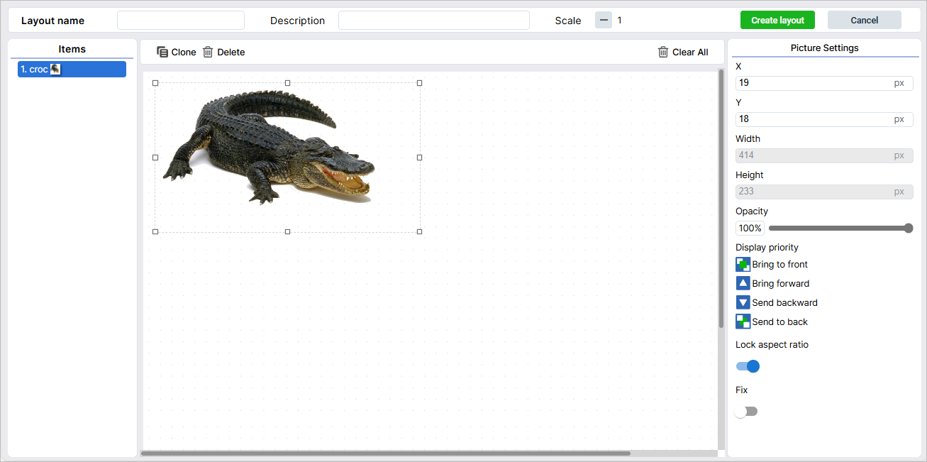
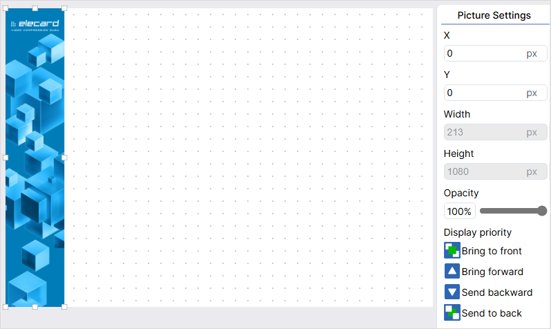
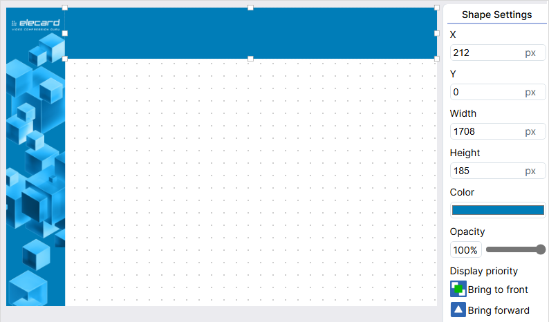
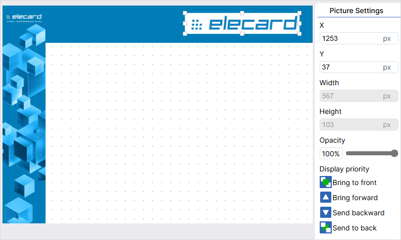
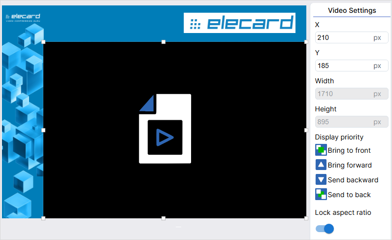
X and Y coordinates
Lets you position items on the layout.
Type values in X and Y fields or drag the item with the mouse.
All items
Width and height
Lets you set the size of an item.
Pull the item to change its size. If the Lock aspect ratio option is enabled, the height and width of the item will change on the ratio basis. To set the values of height and width manually, disable the option.
All items
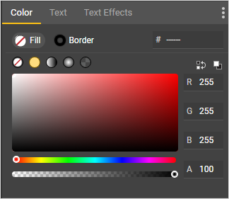
Color
Lets you set the color of a font or a shape.
Click the palette under the Color heading. Select a color by clicking on the palette area or type in values according to the RGB model. Move the slider along the scale under the palette to move between palette shades. To select a color from an image, use the Eyedropper tool, which is to the left of the scale. Click the tool icon and then click the image area with the color you need.
All except Picture and Video items
Opacity
Lets you set the opacity of the font, picture or shape.
Move the slider to select the required opacity value.
All except the Video item
Display priority
Lets you set the priority for displaying a certain item if several items overlay.
Bring the selected item forward, backward, to the front or to the back by clicking the corresponding icons.
All items
Fix
Lets you prohibit the movement of an item in the work area.
Click the Fix toggle to enable the option.
All items
Lock aspect ratio
When enabled, the option keeps the aspect ratio of the item when resizing it with the mouse.
To set the size manually, disable the option by clicking the Lock aspect ratio toggle.
In this section, you can find an example of creating a layout.
It comprises two rectangles: a horizontal one, which is called a header, and a vertical one, which will be a sidebar to the left.
In the center, there is an item where the video is played.
You can choose any design you want.
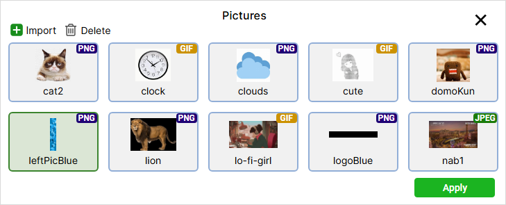
To insert the side bar image, click the Picture item in the right part of the screen. You will see a panel with available images.
If there is no image you need, add it. To do this, click the Import button and select the image file. If necessary, specify a name, description or tags. Click the Upload button. To delete an image, click the Delete button.
Select the uploaded file and click Apply. The image will appear in the work area.
To position the image, type in X and Y coordinates or drag the image with a mouse. If required, set the size by pulling the image. You can also provide size values in the Width and Height fields manually. To activate these fields, disable the Lock aspect ratio parameter.
Add a shape for the header. Click the Shape item and set its size and position.
Change the shape color. Click the palette to the right, select the Eyedropper tool, and then click the blue color area on the sidebar.
Add the logo image and set its size and position.
Add a Video item, position it, and set its size. For the video to display correctly, the item should have the same aspect ratio as the video, e.g., 16:9.
Tip
A layout doesn’t have to contain video. You can scale one picture over the entire area and use it as a static screensaver.
Type in the layout name in the field on the panel above if you didn’t do it at the very beginning.
Click the Create Layout button in the upper right part of the screen. To get back to the list of layouts without saving, click the Cancel button.
Note
If there are no items in the layout, the Create Layout button is disabled.
Creating Layouts in the External Google Web Designer Editor
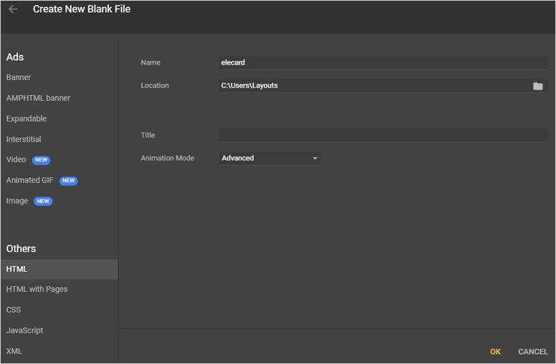
This guide will help you to create layouts in an external editor called Google Web Designer.
Based on the guide, you can use any other tool of your choice.
Install the app on your computer. After the installation, it will open by default.
In the opened window, select Create new file. Select HTML on the left and then enter the file name and location. Click OK.
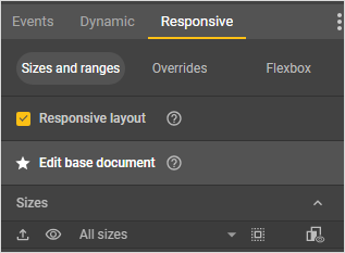
In the window that opened, go to the Responsive tab in the left part of the screen and check the Responsive layout checkbox so that your layout is displayed the same on screens with different resolutions and equal aspect ratios.
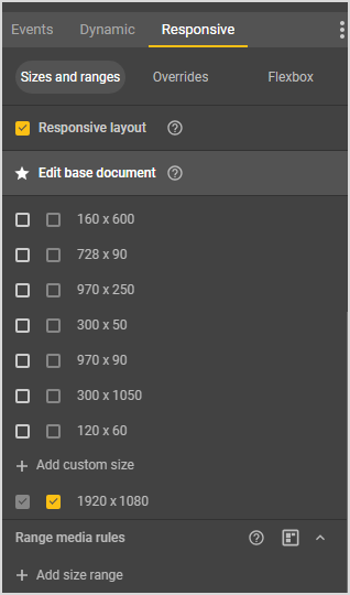
In the same tab, set the layout size corresponding to the resolution and aspect ratio of the screen it will be shown on. The tab should display a list of available sizes. If it does not, place the cursor under the All sizes caption. The cursor will turn into a double-headed arrow. Press down the left mouse button and drag downwards to expand the list of pre-defined sizes. Select the size you need or specify your own by scrolling down to the Add custom size item at the bottom of the list and typing in the required width and height values in the corresponding field. If the field is not active, hover the cursor over it and click on the appeared pencil icon. First, enter width. Then, press Tab on the keyboard to move on to entering height. Press Enter.
To get back to editing the document, click on the Edit base document item above the list with sizes.
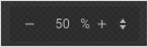
You can zoom out the layout using controls in the lower right corner of the work area where the layout is.
Create a layout based on the example above. There is a tool panel to the left in the Google Web Designer window. To create a rectangle for the sidebar, select the Element tool. You can select instruments using hot keys. For the element tool, it is D. You can also hover the cursor over any tool, and its name will be displayed. By default, the element tool creates div elements, but you can switch it to images as well by clicking a corresponding icon in the upper left part of the screen.
To create an element, place the cursor in any spot of the work area, press down the left mouse button, and drag the cursor in any direction. At this point, the position and the size of the element don’t matter.
Next, you need to align the element by the left side and set its dimensions. You can move the element with the Selection tool (hot key V) from the tool panel, or you can use the Position and size section in the Properties tab. The tab is in the lower right corner of the screen. In the same tab, you can specify the width and height of the element. After you finish, click the Use percentages icon below the width field.
Important
You need to use percentages for all elements so that they are scaled when the screen resolution changes.
You can fill the element you have added with color, add an image to it, or do both. The color palette is in the upper right corner of the program’s screen in the Color tab. Images can be imported with CTRL + Shift + i.
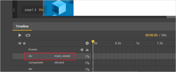
Add another element for the header and style it accordingly.
After you finish with decoration, insert a div element in the empty space. This element will be used to display your video content. Then, go to the Timeline area below the work area, find there the element you have created, double click it, and give it the main_render name.
If you add other elements over the video window (e.g., text), they should be in a separate div.
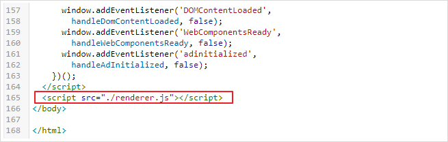
Download the renderer.js file (a link to open the file). Add the file to the root folder of your project. It is the folder where the HTML file of your layout is.
In the upper right part of the Google Web Designer window, switch to the Code view and add the <scriptsrc="./renderer.js"></script> line before the closing </body> tag, which is at the very end of the layout HTML file.
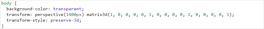
In the same mode, check the background-color property in the body block. The property value should be transparent. You can add this property manually; otherwise, delete the background-color property string.
Save the project and close Google Web Designer.
Rename the HTML file of your layout in the root folder as index.html.
Turn the project folder into a zip archive and upload it to ViCont.
To upload a ready-made layout, click the Import button on the layouts page and select the layout archive.
Next, specify the Layout name and, if necessary, its description.
Click the Upload button to finish importing the layout.
You can remove an unused layout by selecting it in the table and clicking the Delete button.
To apply the layout, add it to a schedule.
Note
When adding a layout, the system will need some time to upload it into the web interface.
The Channel Lists page is used for adding and editing channel lists.
To create a new list, click the Add button.
In the Name field, provide the list name.
You can assign the list to a player and(or) group of players straight away by selecting the required value(-s) in the Assign to player and Assign to group fields, respectively.
Next, supplement the list with channels themselves.
Click Add and specify the channel Number and Name in the window that opened.
Select the type of the content source for this channel, i.e. a Stream or a Schedule.
In the last field, select either a specific stream or schedule, depending on the selected source type.
Click Add.
The channel will appear in the list.
If you need to make changes to the added channel, go to the Control column and click .
To delete a channel, click .
After you are done with compiling the list of channels, save it by clicking the Add button.
To edit one of the existing lists, click in the Control column on the Channel Lists page.
Make the required changes and click Apply.
In the editing window, you can also create a copy of an existing channel list by clicking the Clone List button in the upper left corner.
The copy will appear on the page and will be marked with an asterisk.
To delete a channel list, tick its checkbox and click the Delete button.
The Schedules page is used to create and edit schedules.
Previously created schedules are displayed on the page in the form of a table.
If you want to generate a new schedule, click on the Add button.
To edit an existing schedule, go to the Control column in the selected table row and click on .
The creation or editing of a schedule takes place on a separate page that provides a set of tools to form an order in which media files and layouts are played.
The page comprises five parts:
1 — General settings panel
2 — Sidebar with block types and drag-and-drop item area
3 — Page numbering
4 — Schedule control panel
5 — Timeline
On the General settings panel, fill in the Schedule name.
If necessary, provide the schedule description in the Description field.
To assign the schedule to one or more groups of players, select their names from the drop-down list.
Below are the sidebar with block types and drag-and-drop item area. Inside the sidebar, there are eight tabs in total: Video, Audio, Picture, Stream, Playlist, Presentation, Web page, and Layout.
You can add/import new files and (or) entities thanks to the sidebar: to do that, access the necessary tab and click on Add or Import.
In case with layouts and presentations, you can also click on Create to create a new entity without leaving the page.
To the right you will see the uploaded files that correspond to the type of tab you chose.
To navigate through items that can be added to the schedule more easily, set the number of items for display in the Page numbering area.
In the lower part of the page, there is the Schedule control panel and the Timeline, comprising several layers.
To add a block to the schedule, simply drag it onto the required timeline layer.
Optionally, you can add a block by clicking on Add Block: This way, you will open an edit window which can also be accessed via the Edit button.
To manage an item added to the timeline, click on it; this will cause the Clone, Edit, and Delete buttons to appear on top of the panel.
You can also delete items without leaving the Schedules page. To do so, hover the cursor over an item in the drag-and-drop area, then tick the corresponding checkbox, click the Delete button that popped up above, and confirm deletion.
Warning
If you delete an item from the drag-and-drop area, you will erase it from the system entirely.
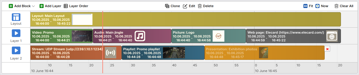
By default, each schedule comprises Media and Layout layers.
Each layer contains a set of blocks that define which object to play and its duration.
The Layout layer allows you to add layouts that will appear in parallel or on top of the media content playing in the background.
A schedule can contain only one such layer.
You can select only the Layout block type for this layer.
The Media layer allows for adding media files (videos/audios/pictures), streams, playlists, presentations, and web pages to be displayed.
A schedule can contain multiple Media layers.
For the Media layer you can select such blocks as Video, Audio, Picture, Stream, Playlist, Presentation, Web page.
To create a new Media layer, click the Add Layer button on the Schedule Control Panel.
In the window that opens, specify the Name of the layer, then click the Add button.
Please note that the streaming priority is given to the top layer.
To change the order of layers, click on the Layer Order button and arrange the layers in such a way that the desired layer is placed at the top. Save changes.
You can give the Media layer its own name.
Hover the mouse over the word Media, and you will see the icon to the left of it.
Click on the icon and specify a new name in the opened window.
If necessary, change HTML id.
Click Apply.
You can delete an additional Media layer by hovering over the layer and clicking on the cross.
The player group will play the next layer in case the first layer contains a free time slot.
Additional Media layers can be used for streaming backup.
In case the player group has a schedule with multiple Media layers, it will start playing the next layer when the main Media layer fails.
To add a block to the schedule, go to the necessary tab in the Drag-and-Drop Item Area.
Press and hold down the left mouse button on the selected item and drag it directly on the timeline layer using the Drag-and-drop function.
Note
You cannot drag a block on a layer that does not support this block.
The system will not let you do this, and the layer’s color will turn red.
The vertical red line on the timeline indicates the current moment.
Each time you drag a block, you will also see a black line that helps to position this block accurately based on the moment in time.
The duration of Video, Audio, Playlist and Presentation blocks is set in advance.
For other blocks, the duration is calculated when you drag them onto the schedule.
In this case, the duration amounts to 20% of the timeline that is currently visible on the screen. The timeline scale is also taken into account.
For example, the timeline scale is displayed in minutes, and the currently visible timeline part is 10 minutes.
As a result, when you add a block without duration, its length will be set to 2 minutes.
The timeline is always positioned based on the last added block.
The timeline scale and block sizes will also adjust automatically.
For instance, if you add a 10-second video, the timeline scale will be set to seconds.
If you then add a 20-minute playlist, the scale will change to minutes, and the size of the first block will decrease.
You can zoom in and out of the timeline as required.
To zoom, place the mouse pointer inside the timeline and scroll the mouse wheel until the desired zoom is achieved.
Blocks cannot overlap in time.
The next block should start only when the previous one is over.
Imagine, there are two blocks in the schedule with a 10-minute gap between them.
If you want to insert another block in the gap, the duration of that block should fit in the gap.
The color of the block corresponds to the selected type and allows you to quickly assess the content of the schedule:
olive — layout;
green — video;
purple — audio
blue-gray — picture;
gray — web page;
brown — stream;
blue — playlist;
golden — presentation.
The block type is also indicated on the block together with the name of the selected item and its duration.
For a Stream block, there is also the source URI.
To change the block timing or playback order, click on the block with the left mouse button and drag it to the right to schedule it for future playback or to the left to schedule it for earlier playback.
To change the playback duration, drag one of the block’s vertical edges to set the desired duration.
Note
A block can only be moved within a layer.
To adjust the display of blocks, click the Fit button.
As a result, the timeline scale will change and all blocks will be displayed on one screen.
The Now button allows you to jump to the current moment on the timeline.
You can delete all blocks and clear the schedule with the Clear All button.
If you select a certain block, you will also see the Clone, Edit and Delete buttons on the Schedule Control Panel.
Clicking the first button creates a copy of the selected block.
To change the block settings, for example duration, click the Edit button; to delete the block, click Delete or click the cross at the top right corner of the block.
You can select multiple blocks at once to move, duplicate, and delete them together.
To do this, hold down the Ctrl button on the keyboard and select the required blocks by left-clicking each of them one by one.
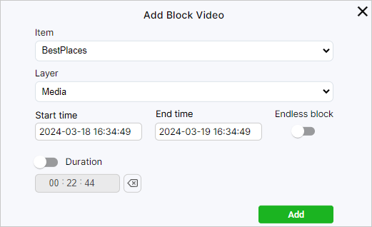
Besides dragging, you can add blocks using the Add Block button.
This method allows you to set a desired playback start and end time even for blocks with duration specified in advance (videos, playlists, pictures).
Click the button and select the type of the block you want to add.
Once the block type is set, select the media option you want to use from the Item drop-down list.
Each option in this list corresponds to an item previously added to the system.
Note that once you have added a block, you cannot change its type or the item to be played.
Next, set the Start Time and the End Time for the item playback.
If required, you can specify the Duration instead of the end time.
Otherwise, you can enable the Endless block setting, and the player loops playing the block, beginning from the indicated start time.
The endless block will take the entire remaining time on the layer, and you will not be able to add other blocks after this block.
Click on the Add button to complete the creation of the new block.
On the Emergency page, you can configure the demonstration of an emergency playlist for groups and players.
An emergency playlist is a set of video files that can be assigned to individual players or groups of players for emergency broadcasting of media content.
It can be used to quickly pause the current demonstration of media content and start playing a pre-compiled playlist. Only Emergency type playlists can be used for emergency demonstration.
Important
Emergency playback supports video files only.
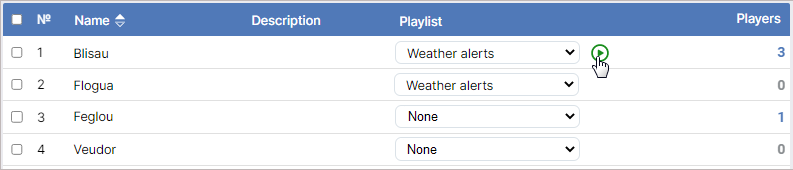
To assign an emergency playlist to one or multiple players, go to the Emergency ➝ Players section.
In case of multiple players, tick their checkboxes and select a playlist from the drop-down menu in the Common Playlist section. Click the Play button to start the demonstration. As soon as the player starts playing the playlist, the icon will appear in the Status column of the Players page. To stop the demonstration, click the Stop button.
To assign an emergency playlist to a single player, go to the Playlist column, select the required playlist from the drop-down menu, and click the button. When hovered over, the button changes color to green.
After clicking, the button will turn into the button.
Click it to stop playing the emergency playlist.
In the Emergency ➝ Groups section, you can configure the demonstration of an emergency playlist for one or multiple groups of players.
The procedures for assigning an emergency playlist to players and groups are similar.
Thus, to assign a playlist to several groups, select the desired groups, specify a common playlist, and run it.
You can set an emergency playlist for one group by selecting a playlist from the drop-down menu in the group row.
As soon as the group players start playing the playlist, the icon will appear in the Status column of the Players page.


 .
To delete one of the filters, click
.
To delete one of the filters, click  to the right of the field for selecting the filter value.
After you are done with settings, click Apply.
To remove all filters, click Clear All.
to the right of the field for selecting the filter value.
After you are done with settings, click Apply.
To remove all filters, click Clear All.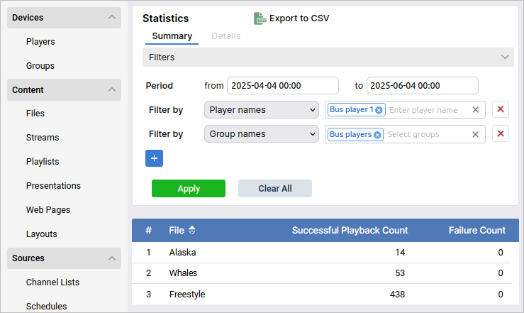
 icon will open a window where you can adjust sound volume level or select a channel if a channel list is used as a source of content for the player.
To adjust volume, use
icon will open a window where you can adjust sound volume level or select a channel if a channel list is used as a source of content for the player.
To adjust volume, use  and
and  button.
To switch to another channel, select it from the Channel drop-down list.
The selected channel and the current volume level are displayed in the upper part of the window.
button.
To switch to another channel, select it from the Channel drop-down list.
The selected channel and the current volume level are displayed in the upper part of the window.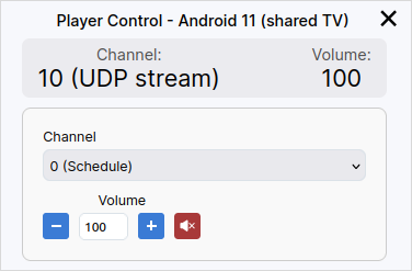
 button in the Control column lets you lock the player to avoid changing its settings accidentally.
When the player is locked, any change in its settings, including changing the group, will be applied only when the player is unlocked.
If you change the settings of the group in which the locked player is included, the player will continue to use the settings that were active before locking.
The updated group settings will take effect for such a player only after it is unlocked.
button in the Control column lets you lock the player to avoid changing its settings accidentally.
When the player is locked, any change in its settings, including changing the group, will be applied only when the player is unlocked.
If you change the settings of the group in which the locked player is included, the player will continue to use the settings that were active before locking.
The updated group settings will take effect for such a player only after it is unlocked. button in the Control column restarts the player.
 .
In the opened window, you will see a timeline with thumbnails that is updated in real time (moves left).
The current moment is marked with a vertical red line.
Above the timeline, there is information about the player and control buttons, the same as in the table with the list of players.
To view the thumbnail history for a certain period, set the from and to dates in the fields under the timeline and click Apply.
You can sort the records using the
.
In the opened window, you will see a timeline with thumbnails that is updated in real time (moves left).
The current moment is marked with a vertical red line.
Above the timeline, there is information about the player and control buttons, the same as in the table with the list of players.
To view the thumbnail history for a certain period, set the from and to dates in the fields under the timeline and click Apply.
You can sort the records using the  button.
To clear the filters, click Clear All.
To go back to the list of players, use the Players button.
button.
To clear the filters, click Clear All.
To go back to the list of players, use the Players button.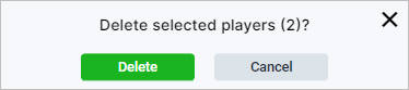
 in the Control column.
You can change the name, description, and(or) tags.
in the Control column.
You can change the name, description, and(or) tags.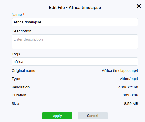
 icon added to its row.
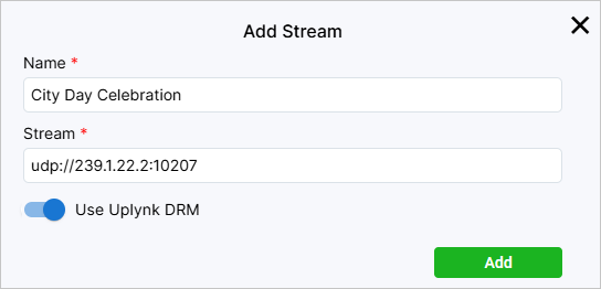
 icon at the start of the required element row, press down the left mouse button, and drag the row up or down.
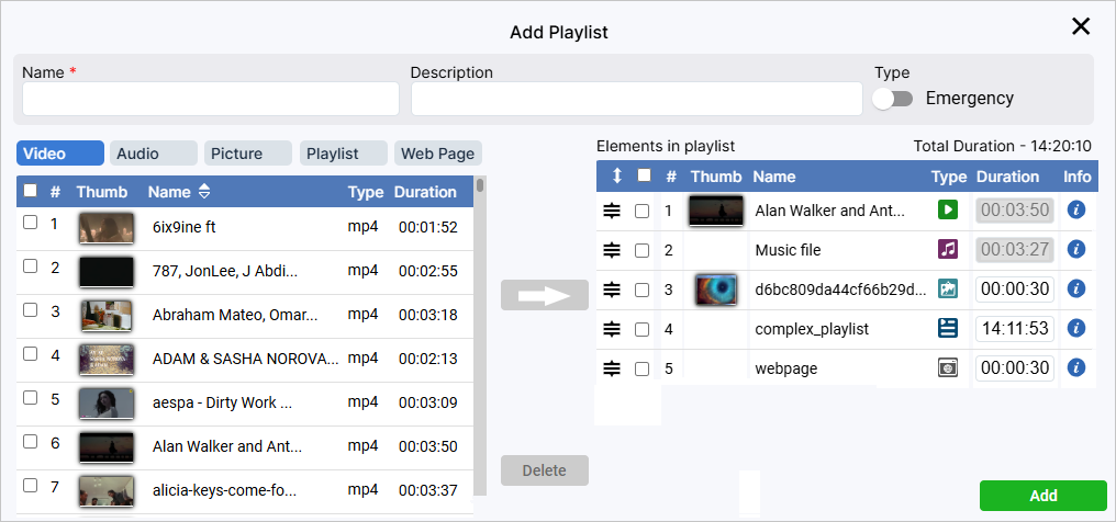
 in the corresponding line within the Structure column.
 and
and  buttons in the Position column.
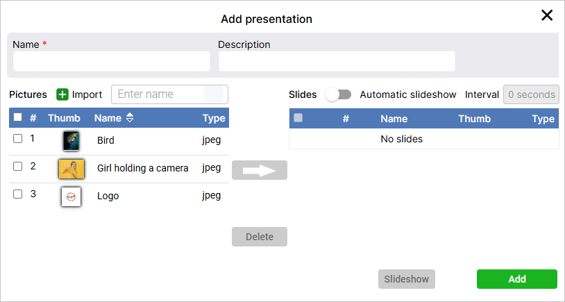
 icon marks layouts created in the ViCont editor that can be edited after creation.
 button for downloading the layout in the form of an archive will also appear in the Control column.
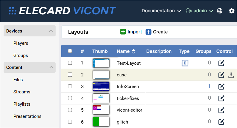
 .
.


 Import.


 . You can select instruments using hot keys. For the element tool, it is D. You can also hover the cursor over any tool, and its name will be displayed. By default, the element tool creates div elements, but you can switch it to images as well by clicking a corresponding icon
  in the upper left part of the screen.
 (hot key V) from the tool panel, or you can use the Position and size section in the Properties tab. The tab is in the lower right corner of the screen. In the same tab, you can specify the width and height of the element. After you finish, click the Use percentages icon below the width field.
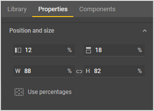
 .
After you are done with compiling the list of channels, save it by clicking the Add button.
.
After you are done with compiling the list of channels, save it by clicking the Add button.
 Clone,
  Delete button that popped up above, and confirm deletion.
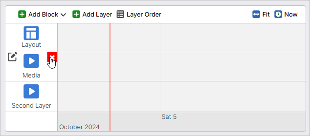
 icon will appear in the Status column of the Players page. To stop the demonstration, click the Stop button.
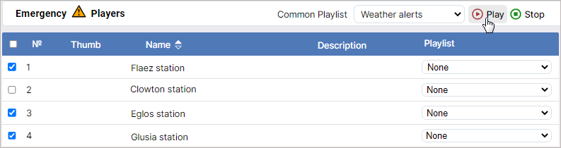
 button. When hovered over, the button changes color to green.
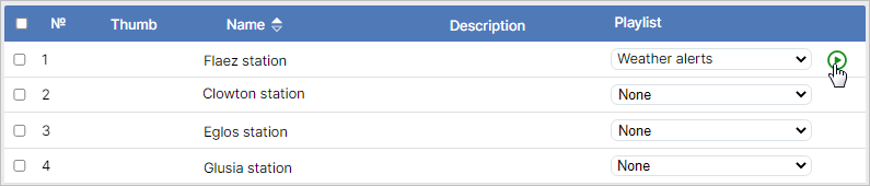
 button.
Click it to stop playing the emergency playlist.
button.
Click it to stop playing the emergency playlist.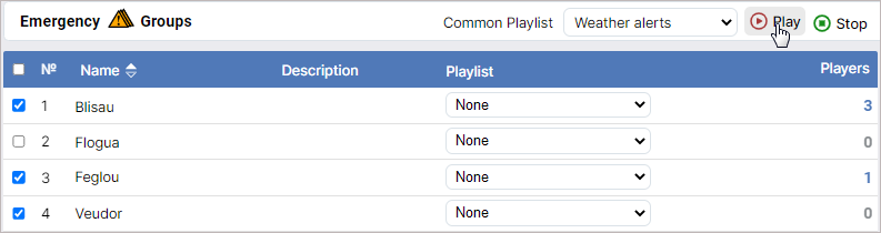
 icon will appear in the Status column of the Players page.