


 .
To delete one of the filters, click
.
To delete one of the filters, click  to the right of the field for selecting the filter value.
After you are done with settings, click Apply.
To remove all filters, click Clear All.
to the right of the field for selecting the filter value.
After you are done with settings, click Apply.
To remove all filters, click Clear All.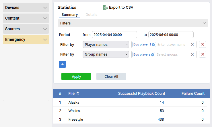
 .
To replace it, click on
.
To replace it, click on  ; to delete—click on
  .
You can also hide/show the name of the to-be-added element by toggling the Show name switch.
Once done with these settings, click on Add.
.
You can also hide/show the name of the to-be-added element by toggling the Show name switch.
Once done with these settings, click on Add.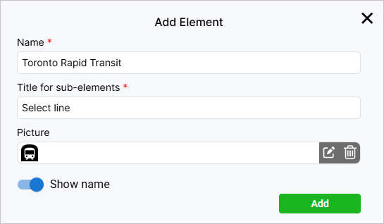
 .
This way, the page will display the general list of players that were added to the system.
.
This way, the page will display the general list of players that were added to the system. .
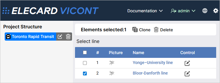
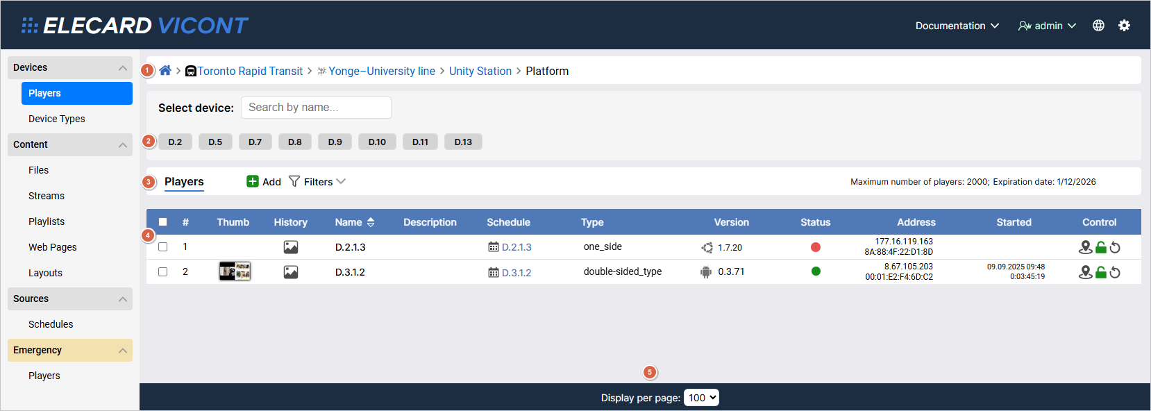
To avoid changing some settings by accident, you can block editing altogether by clicking on
.
To avoid changing some settings by accident, you can block editing altogether by clicking on  .
If a player is locked, all changed settings will be applied only once it’s unlocked.
To restart a player, click
.
If a player is locked, all changed settings will be applied only once it’s unlocked.
To restart a player, click  .
. .
You will be redirected to a new page—there you will find a timeline moving to the left.
The red vertical line shows the present moment.
Above the timeline are the related information and control buttons—the latter are the same as in the Players table.
To browse screenshot history in a given period, specify the time frame using from and to fields and click Apply.
You will then be given a mosaic of screenshots.
To sort the screenshots from oldest to newest or vice versa, click
.
You will be redirected to a new page—there you will find a timeline moving to the left.
The red vertical line shows the present moment.
Above the timeline are the related information and control buttons—the latter are the same as in the Players table.
To browse screenshot history in a given period, specify the time frame using from and to fields and click Apply.
You will then be given a mosaic of screenshots.
To sort the screenshots from oldest to newest or vice versa, click  .
To reset all filters, click Clear All.
To go back to the list of players, click Players.
.
To reset all filters, click Clear All.
To go back to the list of players, click Players.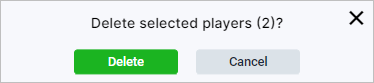
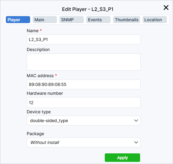
 or double-sided
  .
A double-sided device has two distinct screens that can broadcast different content.
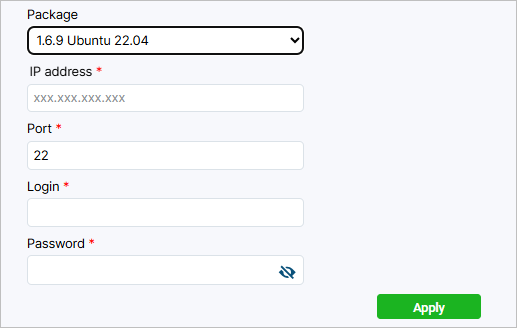
Each device type is linked to its own
.
A double-sided device has two distinct screens that can broadcast different content.
Each device type is linked to its own 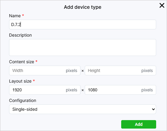
6. Content
The Content section comprises such pages as Files, Streams, Playlists, Web Pages, Layouts. These are the types of content supported by ViCont InfoBoards players. By selecting a certain page, you can add new content to the system or edit the parameters of already added entities.
Files
The Files page is for adding/editing video and audio files, as well as pictures. You can use files to make playlists or include them in schedules. Pictures are also used to create layouts. Supported file extensions include:
video:
ts, mp4, mpegts, mpeg, avi, mov;audio:
mp3, mp4, m4a, aiff, aac, flac, ogg, wav;pictures:
jpeg, gif, png, bmp.
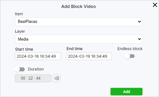
To add a new file, on the panel above the list of files, select either the Videos, Audios or Pictures tab depending on what type of file you want to add. Click the Import button and select the required file. Then click the Open button, and the file upload window will appear. Add the file description and/or tags; if necessary, rename the file. Click the Upload button.
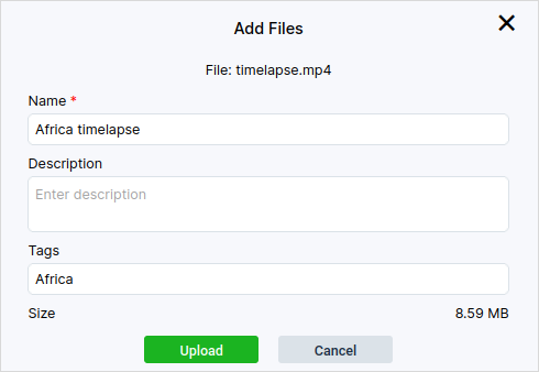
You can add multiple files at the same time. However, adding a description to multiple files or changing their names is not supported.
Note
When adding a file, the system will need some time to upload it to the web interface.
Once uploaded, the file will appear on the page. To filter uploaded files by name or tag, use the corresponding fields above the file list in the top right corner.
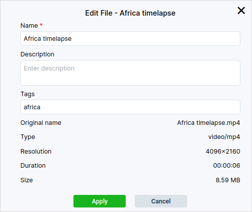
To edit an uploaded file, click on its name, causing a configuration window to pop up. You can change the name, description, and/or tags.
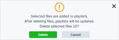
To delete a file, select one or more files and click Delete. Confirm deletion. Please note that deleting a file will also remove it from playlists and schedules in which it is included.
Streams
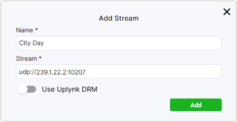
The Streams page lets you add and edit streams. To add a new stream, click the Add button. In the window that opens, enter the stream name in the Name field. In the Stream field, specify the network address that the media stream is transfered to from the streaming provider non-stop. Ubuntu-based ViCont InfoBoards players support UDP, RTP, and SRT streaming, while those based on Android support HTTP(S), UDP, RTP, SRT, HLS, and MPEG-DASH protocols. You can protect a stream from unauthorized access by toggling the Use Uplynk DRM switch. If enabled, prior to starting the stream the player will request the Uplynk token from the ViCont InfoBoards server.
After adding a stream, you can change its name or specify a new address, if necessary. To do this, click on the name of the stream that you’d like to edit.
To delete a stream, select one or more streams and click Delete. Confirm the deletion.
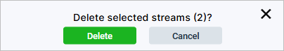
Warning
Deleting a stream will also remove it from the schedule(s) that contain said stream.
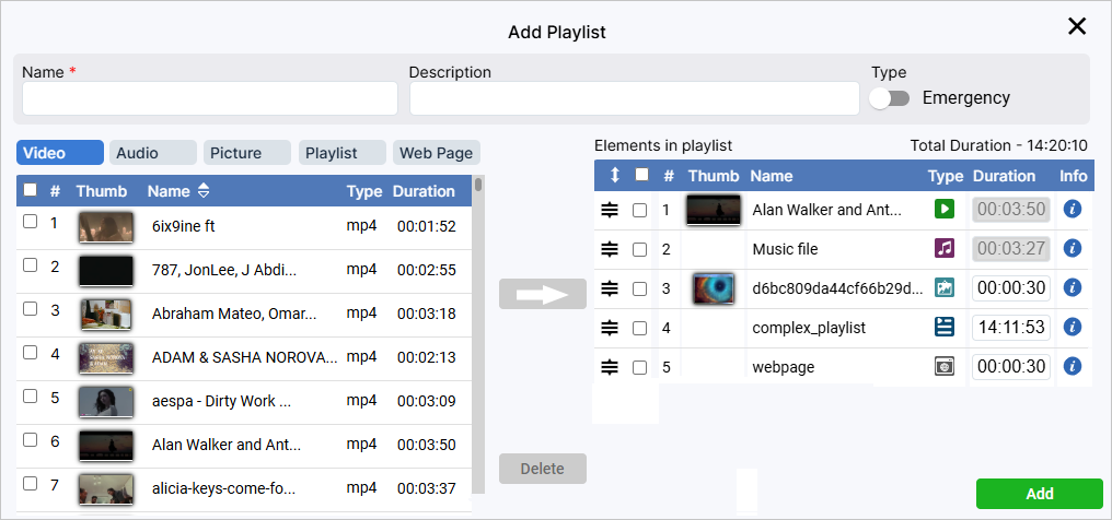
Playlists
Playlists are sets of elements uploaded to the system. They can be of two types: ordinary and emergency. An ordinary playlist consists of video, audio, and images and can be added to a schedule for planned playback. An emergency playlist is used for organizing emergency broadcasting and cannot be added to a schedule. You can find more information about emergency playlists in the Emergency section.
When you enable the Emergency setting, the playlist will be added to the emergency list.
To set up a playlist, in the table to the left choose what type of element you want to add: supported are the Video, Audio, Picture, Playlist, and Web Page types. Then below tick the checkboxes of the elements you need. Move the ticked elements to the playlist by clicking the arrow directed to the right. To delete files, tick them in the playlist (the table to the right) and click Delete.
You can change the order of elements in the playlist.
Hover the cursor over the  icon at the start of the required element row, press down the left mouse button, and drag the row up or down.
In the Duration column, you can specify the duration for elements that don’t have it originally, e.g. pictures. Go to the column and set the necessary value for the required element in the active field.
Note
You can’t change the duration of elements that have it initially, such as video or audio files. In this case, the field in the Duration column will be inactive.
You can browse the information regarding the newly added element by clicking on  in the corresponding row.
When it comes to video, audio, and pictures, you can browse their names and resolution; in case of playlists you can browse their lists of elements, in case of web pages—web pages’ names and links.
in the corresponding row.
When it comes to video, audio, and pictures, you can browse their names and resolution; in case of playlists you can browse their lists of elements, in case of web pages—web pages’ names and links.
After the playlist is formed, click the Add button.
If necessary, you can edit a previously created playlist. Click on the playlist’s name, make the necessary changes, and click the Apply button.
Warning
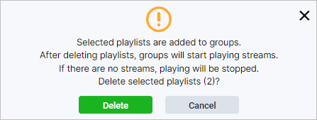
If you delete a playlist, it will also be deleted from schedules it was included in.
Complex Playlists
A playlist is considered complex in case it includes a web page and (or) a nested playlist.
Note
Playlist inside a playlist has to be simple, meaning that it can only be comprised of basic entities such as audio or video files as well as pictures.
By adding a playlist to another playlist, you will see the latter having an icon  in the corresponding row within the Structure column.
Note that when inside a schedule, a nested playlist will have an extra frame surrounding it, with the only info available being the total duration of the elements inside the nested playlist.
in the corresponding row within the Structure column.
Note that when inside a schedule, a nested playlist will have an extra frame surrounding it, with the only info available being the total duration of the elements inside the nested playlist.
Web Pages
On the Web Pages page you can add a link to a web page to add it to a schedule in the future. During the playback of the schedule, the web page will be displayed to the user who can interact with it, e.g. using a remote control.
To add a link, click Add, enter the web page Name and URL. If necessary, provide a description and specify a refresh interval. Click Add.
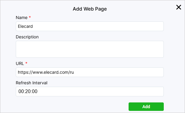
You can edit a web page by clicking on its name.
Layouts
Note
Working with layouts is supported by Ubuntu-based players’ version 1.4.2 and higher, as well as Android-based players of all versions.
On the Layouts page, you can add new layouts to overlay streams or video files that should be played.
The layout structure resembles the structure of a web page.
You can create layouts in the native ViCont InfoBoards editor or in an external editor.
The layout created in ViCont InfoBoards is called a native layout and can be changed in the ViCont InfoBoards editor.
An archive with a native layout comprises image files, if used, and the index.html file that defines a set of overlay objects and their order, forming the layout structure.
A layout created in an external editor cannot be changed in ViCont InfoBoards.
An archive with such a layout also includes the renderer.js script, a system file required to play video within the layout.
A list of added layouts is displayed as a table with the following columns:
Name — displays the layout name.
Description — contains the layout description.
Type — indicates the layout type. The
 icon marks layouts created in the ViCont InfoBoards editor that can be edited after creation.
If you click on a layout’s name, you will open a window where you can change the layout’s name and description. In the case of native layouts, you can also edit their structure in the ViCont InfoBoards editor. To open it, click on a natve layout’s name and then on Editor. When hovering over a table row, the  button for downloading the archived layout will also appear in the Control column.
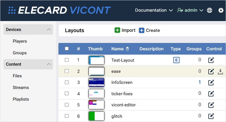
You can make a layout’s copy by ticking its checkbox and clicking on Clone—the latter will pop up after you tick one checkbox or more. To delete a layout, click Delete.
ViCont InfoBoards Layout Editor
Explained below is the process of creating and editing layouts in the ViCont InfoBoards editor.
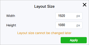
To open the editor and start working on the layout, click the Create button on the panel above.
In the window that opened, set the layout width and height.
The size used by default is 1920×1080 pixels.
Click Apply.
To get back to the screen with the list of layouts, click  .
.
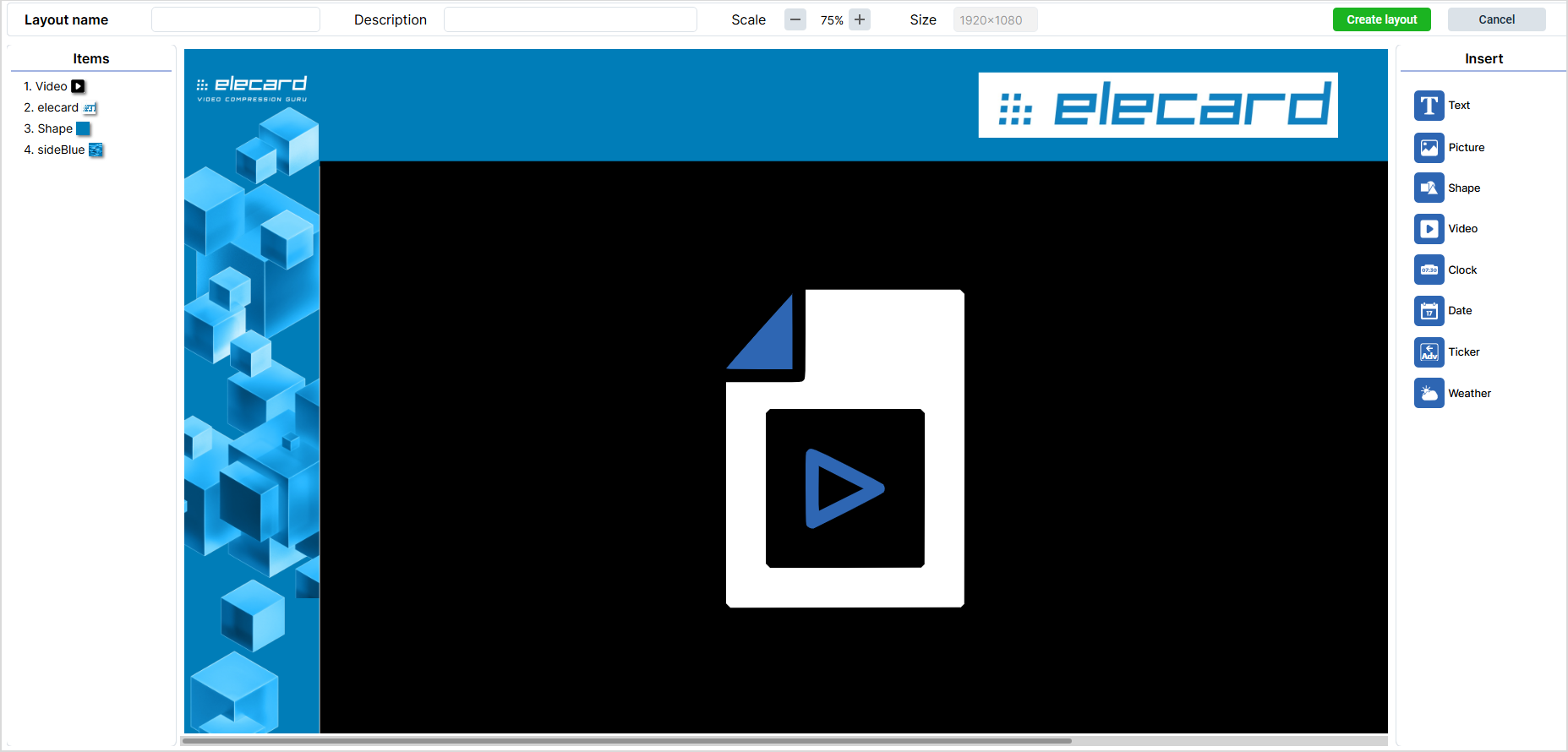
In the center of the editor, there is a work area. It is in this area that you create a layout by adding and combining items. Above the area, there is a panel where you need to write the layout name. Here, you can also provide the layout description, change the scale of the work area, or view the current layout size.
To the left of the work area, there is the Items panel. It will display a list of all items that you add to the layout. The display order of items can be set up by changing the order of these items on the panel. You can also rename an item by double-clicking it and typing a new name. To the right of the work area, there is the Insert panel where you can select items to insert. Clicking an item adds it to the work area. At the same time, the Clone and Delete buttons appear to the left above the work area. When you click the first button, a copy of the selected item is created in the work area. Clicking the second button deletes the selected item. To the right, there also appears the Clear All button. It deletes all blocks and clears the work area. After clicking it, you need to confirm the action by clicking Delete.
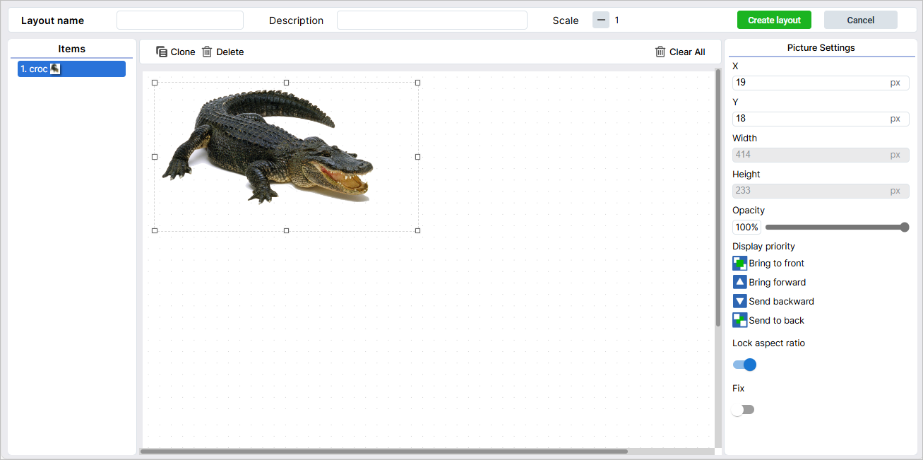
The right part of the screen contains settings of added items. Some settings are common for all or the majority of items. Others are available only for single items. You can find a list of available items and their individual settings in the table below:
Icon |
Item |
Settings |
Note |
|---|---|---|---|
|
Text |
Font: Arial/Courier New/Monospace/Times New Roman
Size: size in pixels
Font style: normal/italic/bold/bold italic
Effects: none/strikethrough/underline
Align: Left/Center/Right/Top/Middle/Bottom
|
|
|
Picture
Shape
Video
|
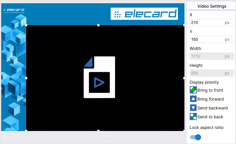
Lock aspect ratio: enabled/disabled |
When enabled, the option keeps the aspect ratio of the item when resizing it with the mouse. To set the size manually, disable the option by clicking the Lock aspect ratio toggle. |
|
Clock |
24-hour time: enabled/disabled
Show seconds: enabled/disabled
Time zone: time zone in UTC
|
All the Text item settings are available for the Clock item, except effects. |
|
Date |
Format: a date in the DD.MM.YYYY, YYYY-MM-DD or MM/DD/YYYY format
|
All the Text item settings are available for the Date item, except effects. You can also select a UTC time zone. |
|
Ticker |
Scroll direction: right-to-left/left-to-right
Ticker speed: a value in seconds that shows the time taken by the ticker to go all the way from appearing to disappearing
|
All the Text item settings are available for the Ticker item, except align. |
|
Weather |
City: a drop-down list in which you can select a city to display weather for
Displayed city name: a box in which you can enter a city name to display on the screen
City search: a box to search for a city by typing its name
Unit of measurement: Degree Celsius (°C)/Degree Fahrenheit (°F)
Show picture: show/hide
Show name: show/hide the city name
|
All the Text item settings are available for the Weather item, except effects. To find a city, enter its name and click the green circle with a check mark. |
|
QR code |
Name: a line where you have to specify the QR code’s name
Information: a line where you have to specify the information for display when scanned; this could be plain text, a link, etc.
Size: a line where you have to set the QR code’s size in pixels
Code color: a color palette that lets you choose the QR code’s color
Background color: a color palette that lets you choose the color for the QR code’s background
|


In the table below, you can find settings that are common for the majority of items.
Name |
Description |
Application |
Items |
|---|---|---|---|
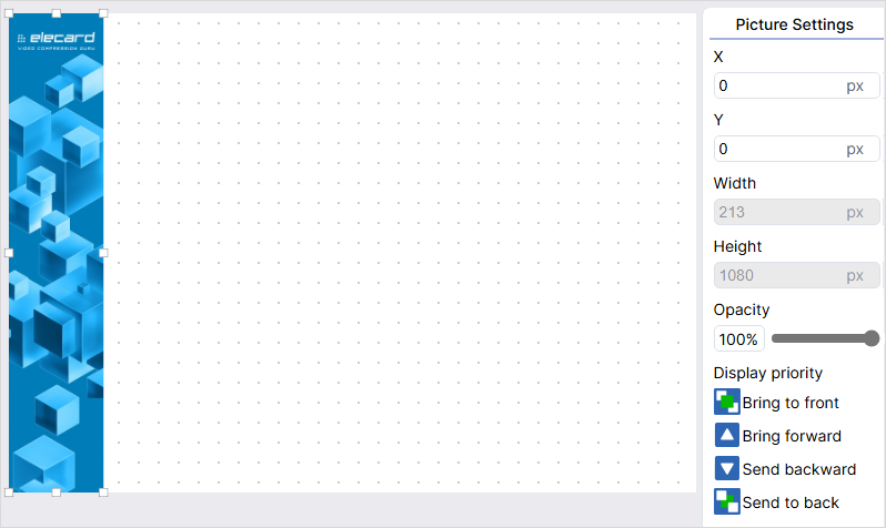
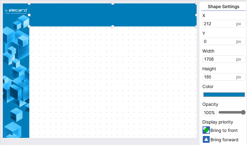
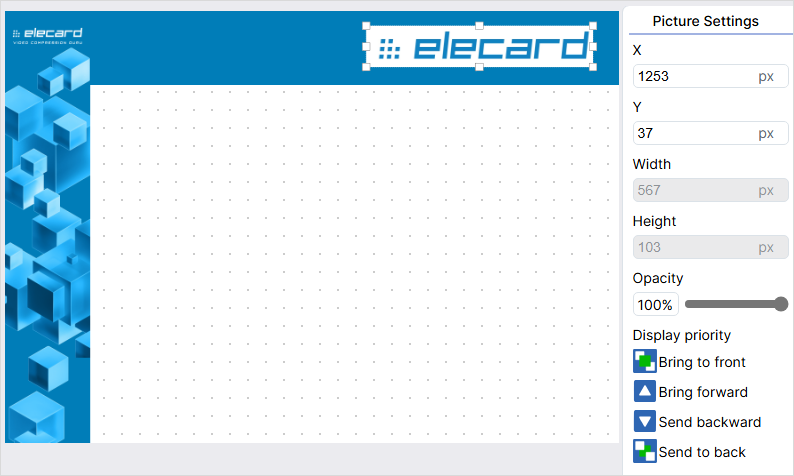
X and Y coordinates |
Lets you position items on the layout. |
Type values in X and Y fields or drag the item with the mouse. |
All items |
Width and height |
Lets you set the size of an item. |
Pull the item to change its size. If the Lock aspect ratio option is enabled, the height and width of the item will change on the ratio basis. To set the values of height and width manually, disable the option. |
All items |
Color |
Lets you set the color of a font or a shape. |
Click the palette under the Color heading. Select a color by clicking on the palette area or type in values according to the RGB model. Move the slider along the scale under the palette to move between palette shades. To select a color from an image, use the Eyedropper tool, which is to the left of the scale. Click the tool icon and then click the image area with the color you need. |
All except Picture and Video items |
Opacity |
Lets you set the opacity of the font, picture or shape. |
Move the slider to select the required opacity value. |
All except the Video item |
Display priority |
Lets you set the priority for displaying a certain item if several items overlay. |
Bring the selected item forward, backward, to the front or to the back by clicking the corresponding icons. |
All items |
Fix |
Lets you prohibit the movement of an item in the work area. |
Click the Fix toggle to enable the option. |
All items |
Creating Layout in the ViCont InfoBoards Editor
In this section, you can find an example of creating a layout. It comprises two rectangles: a horizontal one, which is called a header, and a vertical one, which will be a sidebar to the left. In the center, there is an item where the video is played. You can choose any design you want.
To insert the side bar image, click the Picture item in the right part of the screen. You will see a panel with available images.
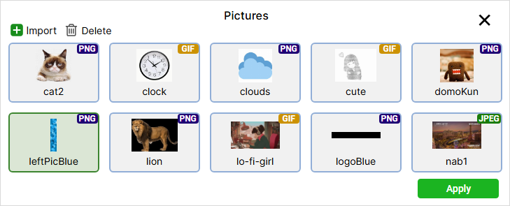
If there is no image you need, add it. To do this, click the Import button and select the image file. If necessary, specify a name, description or tags. Click the Upload button. To delete an image, click the Delete button.
Select the uploaded file and click Apply. The image will appear in the work area.
To position the image, type in X and Y coordinates or drag the image with a mouse. If required, set the size by pulling the image. You can also provide size values in the Width and Height fields manually. To activate these fields, disable the Lock aspect ratio parameter.
Add a shape for the header. Click the Shape item and set its size and position.
Change the shape color. Click the palette to the right, select the Eyedropper tool, and then click the blue color area on the sidebar.
Add the logo image and set its size and position.
Add a Video item, position it, and set its size. For the video to display correctly, the item should have the same aspect ratio as the video, e.g., 16:9.
Tip
A layout doesn’t have to contain video. You can scale one picture over the entire area and use it as a static screensaver.
Type in the layout name in the field on the panel above if you didn’t do it at the very beginning.
Click the Create Layout button in the upper right part of the screen. To get back to the list of layouts without saving, click the Cancel button.
Note
If there are no items in the layout, the Create Layout button is disabled.
Creating Layouts in the External Google Web Designer Editor
This guide will help you to create layouts in an external editor called Google Web Designer. Based on the guide, you can use any other tool of your choice.
Go to the Google Web Designer website and download the app.
Install the app on your computer. After the installation, it will open by default.
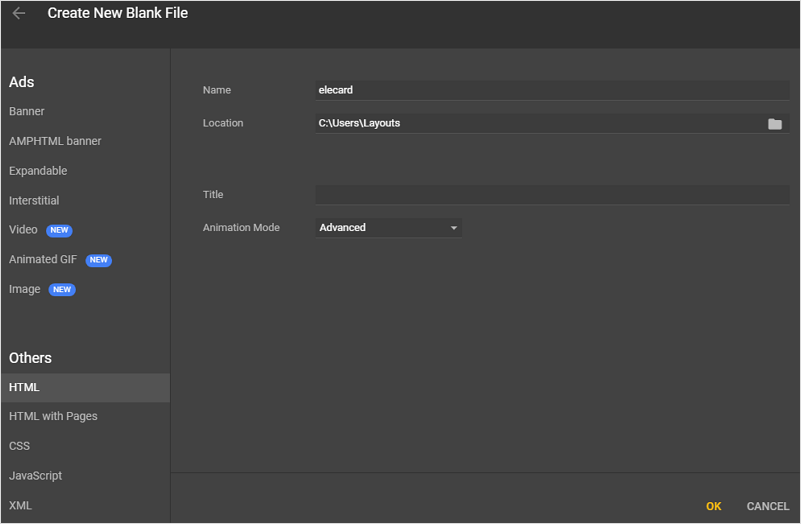
In the opened window, select Create new file. Select HTML on the left and then enter the file name and location. Click OK.
In the window that opened, go to the Responsive tab in the left part of the screen and check the Responsive layout checkbox so that your layout is displayed the same on screens with different resolutions and equal aspect ratios.
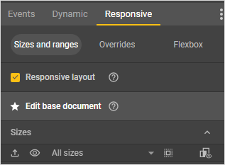
In the same tab, set the layout size corresponding to the resolution and aspect ratio of the screen it will be shown on. The tab should display a list of available sizes. If it does not, place the cursor under the All sizes caption. The cursor will turn into a double-headed arrow. Press down the left mouse button and drag downwards to expand the list of pre-defined sizes. Select the size you need or specify your own by scrolling down to the Add custom size item at the bottom of the list and typing in the required width and height values in the corresponding field. If the field is not active, hover the cursor over it and click on the appeared pencil icon. First, enter width. Then, press Tab on the keyboard to move on to entering height. Press Enter.
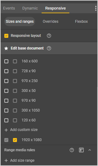
To get back to editing the document, click on the Edit base document item above the list with sizes.
You can zoom out the layout using controls in the lower right corner of the work area where the layout is.
Create a layout based on the example above. There is a tool panel to the left in the Google Web Designer window. To create a rectangle for the sidebar, select the Element tool
 . You can select instruments using hot keys. For the element tool, it is D. You can also hover the cursor over any tool, and its name will be displayed. By default, the element tool creates div elements, but you can switch it to images as well by clicking a corresponding icon
  in the upper left part of the screen.
To create an element, place the cursor in any spot of the work area, press down the left mouse button, and drag the cursor in any direction. At this point, the position and the size of the element don’t matter.
Next, you need to align the element by the left side and set its dimensions. You can move the element with the Selection tool
 (hot key V) from the tool panel, or you can use the Position and size section in the Properties tab. The tab is in the lower right corner of the screen. In the same tab, you can specify the width and height of the element. After you finish, click the Use percentages icon below the width field.
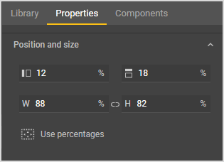
Important
You need to use percentages for all elements so that they are scaled when the screen resolution changes.
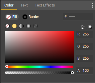
You can fill the element you have added with color, add an image to it, or do both. The color palette is in the upper right corner of the program’s screen in the Color tab. Images can be imported with CTRL + Shift + i.
Add another element for the header and style it accordingly.
After you finish with decoration, insert a div element in the empty space. This element will be used to display your video content. Then, go to the Timeline area below the work area, find there the element you have created, double click it, and give it the
main_rendername.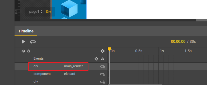
If you add other elements over the video window (e.g., text), they should be in a separate div.
Download the
renderer.jsfile (a link to open the file). Add the file to the root folder of your project. It is the folder where the HTML file of your layout is.In the upper right part of the Google Web Designer window, switch to the Code view and add the
<script src="./renderer.js"></script>line before the closing</body>tag, which is at the very end of the layout HTML file.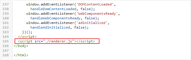
In the same mode, check the background-color property in the
bodyblock. The property value should betransparent. You can add this property manually; otherwise, delete the background-color property string.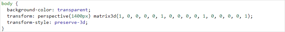
Save the project and close Google Web Designer.
Rename the HTML file of your layout in the root folder as
index.html.Turn the project folder into a zip archive and upload it to ViCont InfoBoards.
Uploading the Layout to ViCont InfoBoards
To upload a ready-made layout, click the Import button on the layouts page and select the layout archive. Next, specify the Layout name and, if necessary, its description. Click the Upload button to finish importing the layout. You can remove an unused layout by selecting it in the table and clicking the Delete button. To apply the layout, add it to a schedule.
Note
When adding a layout, the system will need some time to upload it into the web interface.
 .
Any type of item can be filtered by name via the field Enter name.
Filtering by tag is available for video and audio files as well as pictures: click on the Enter tags field and choose one or more corresponding tag(s).
.
Any type of item can be filtered by name via the field Enter name.
Filtering by tag is available for video and audio files as well as pictures: click on the Enter tags field and choose one or more corresponding tag(s). in the card’s top right corner, you will open a detailed summary of that item.
To edit item information such as name or description, click
in the card’s top right corner, you will open a detailed summary of that item.
To edit item information such as name or description, click  Import button to be replaced with
  Delete. Click on it and confirm deletion.
 Clone,
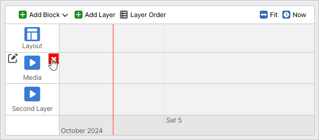
 icon in the Status column.
To stop an emergency playlist’s playback, click Stop.
icon in the Status column.
To stop an emergency playlist’s playback, click Stop.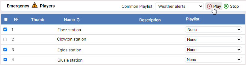
 button.
When hovered over, the button changes color to green.
button.
When hovered over, the button changes color to green.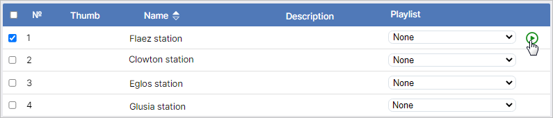
 .
Click on the latter to stop the emergency playlist.
.
Click on the latter to stop the emergency playlist.